Friday 15 July 2022

Are you feeling hot yet?

Record high temperatures forecast for the UK - worrying trends, but it should not be a physiological problem.
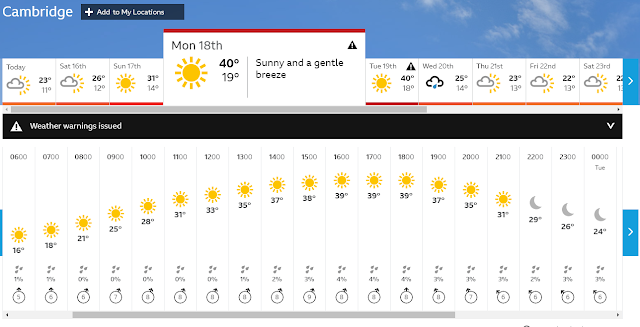


BBC weather predicts highs of 40 degrees C early next week

There seems little doubt that the frequency of 'record high temperatures' in the UK is increasing - our last record was set in July, 2019 and it now looks like that might be broken by more than 1 degree C next week. To have such a large jump in record temperatures within such a short space of time is unusual and worrying too. For sure this is caused by a weather pattern dragging hot air up from southern Europe just at the point at which they are experiencing record temperatures, so it is hard to claim that it is a result of 'average' temperature rises, but the warmer the World gets the more likely these events are going to be.

From a physiological point of view these temperatures are not yet problematic - or at least they would not be if we were properly prepared and therein lies the problem. Just as a small flurry of snow in Winter stops transportation these mini-heat waves also cause problems in the UK whereas in other countries such temperatures would barely raise an eyebrow. The problem is illustrated by the BBC weather forecast with temperatures ramping up from and back down to the low 20s with a peak of 40 for just a couple of days. It is entirely possible to physiologically adapt (acclimate) to the heat, but it takes longer than a couple of days to do so. By Monday when we expect the high temperatures, those who don't exercise, live in cool indoor environments and therefore have little ability to sweat will face a potential thermoregulatory problem. The problem is that radiant heat loss requires a cool environment - or at least one cooler than core body temperature. By the time the temperature is up at 40 degrees C radiant heat loss is useless - the only way of losing the heat we produce (even at rest) is by evaporation. Of course breathing carries away some heat, but not enough: we need to sweat. But, just like you can't suddenly grow strong arm muscles, you can't suddenly grow big sweat glands either. Sweating takes practice. If you don't regularly sweat then your maximal sweating rate will be low. Advice to drink plenty of water will not help as much as you might think - drinking won't promote sweating. Drink if you are thirsty is much better advice.

So, if you do daily exercise, enough to get hot and sweat, you are probably (like me) sitting quite comfortably and looking forward to the warm weather. You will have a cooler resting core body temperature and a capacity to sweat more than enough to deal with the warm weather. But, most people either don't or can't do that amount of exercise and will struggle to raise much of a sweat. Even people who consider themselves to be 'healthy-fit' may fall into this category. About 6 years ago my wife came into the lab to be a subject for a 'sweating' experiment. She sat on an exercise bike and pedalled whilst we measured her core body temperature rise to 39 degrees C. She went red, very red - but, not a drop of sweat. It wasn't that she was dreadfully unfit or overweight - it was just that she never worked hard enough to induce any sweating. Being able to sweat takes training, and by training I mean getting hot enough to need to sweat. There are essentially two ways of doing this - either generate the heat internally by doing exercise, or use external heat (e.g. hot baths or saunas). My wife decided to take-up running and did the wonderful NHS couch-to-5km and now runs (albeit rather irregularly).

There are many strategies to stay cool and most of them are blindingly obvious: reduce activity levels (internal heat generation), stay in a cool environment and use water (applied directly to the skin) to mimic sweating. A wet cloth and a draught is more than enough to stay cool when humidity levels are relatively low. Hot weather and high humidity is a different beast. I recall, as a youngster, sitting very comfortably in a sauna (probably about 100 degrees C - my father built one in our garage) and putting quite a lot of water on the stones. The effect was immediate pain as the humidity rose rapidly causing a dramatic rise in skin temperature. I fled the sauna. Humid hot environments are a real physiological problem to which we don't have a solution.

You might wonder why we don't all have large sweat glands, one that don't need training to keep them big. If having large sweat glands that can produce copious amounts of sweat make Summer heat so easy to deal with, why hasn't evolution caused them to just exist in our skin all of the time? The best guess for why we have trainable sweat glands is that in the Winter sweating is a very dangerous activity - wet skin after running could easily induce hypothermia in Winter. I had not realized just how dangerous this was until I got injured about 2 miles from home one Winter whilst out running. I was dressed in several running jackets, and nicely hot, but they were soaked in sweat and I was forced to walk. I wasn't too concerned since 2 miles seemed entirely 'walkable' but, I had not factored in just how quickly body temperature can fall when you are soaking wet and heat production drops. I now run with a mobile phone and, more importantly, a foil (space) blanket.

Monday 29 July 2019

Measuring (accurately) run courses

Runners often compare distance measurements from GPS devices only to be surprised by the extent of the variation. Some devices do perform better than others (and many enthusiasts have published good comparisons: fellrnr, dcrainmakerthe5krunner) but the errors are often hard to predict and depend upon the atmospheric conditions, the number of turns in the route, visibility of the sky, the positioning of the GPS satellites and the data sampling rate. The importance of accurate distance measurements is easy to appreciate when looking at race data. A twenty minute 5km runner takes 0.24s to cover a metre, so a course that is 50m short (1% error in the distance measurement over 5K) should take 12s less to complete and that is a significant amount of time when comparing 5km race efforts. The problem is that GPS devices generally have errors greater than 1% (fellrnr) often the errors can be closer to 5%.

For road-running races one ideally needs a measurement technique that has less than 0.1% error. Even at 0.1% error the performances can differ by enough of a margin to begin to cause problems, but even using the best techniques it is hard to achieve a higher level of accuracy than that. This level of error is equivalent to 1 m per km, so 5 meters in a 5 km race. Whilst this error is significant in performance terms, it is the level of accuracy where other factors, like the choice of racing line, become more significant even for the seasoned competitor. By way of an example: imagine running a 5000m on an athletics track. If you run the 12.5 laps in lane 1, the regulation 30cm from the inside edge, you will cover 5,000m precisely. Now imagine you could run closer to the inside edge, say 12cm away from it - then, you will save yourself 14 meters. If you run 12cm within the outer line of lane 1 you would have to run a further 76m than the person hugging the inside lane. This example of poor racing line is a 1.5% error in distance. So, most runners should be happy once a course has a distance measurement of 0.1% accuracy since their choice of racing line will be the biggest source of error.

To get within 0.1% accuracy is not difficult. Steel measuring tape is available in 30m lengths and has a thermal expansion coefficient that is so low that we don't need to worry about it (0.001% per degree C). But, laying out this long tape 167 times to make a 5km measurement would be terrible. This is where wheel-based techniques win since each revolution of the wheel is the equivalent of laying down a new length of tape. As long as we can measure how far the wheel travels per revolution and count the number of revolutions then an accurate measurement would seem to be easy to make. Of course surveyor's wheels are readily available and for a modest investment (~£100) a model with calibration certificate can be found. However, they still have the drawback of requiring a person to push it along the whole course and they typically cannot easily deal with rough terrain. It is for these reasons that many prefer to use the wheels on a bicycle - a bicycle that can be ridden at a sensible speed. Indeed, the IAAF only allow race measurements made with 'Jones' counters that follow their extensive manual. The Association of UK Course Measurers replicates most of these procedures including a free (but lengthy) certification process. The Jones counter is nothing terribly special - it is a physical counter turned by a sprocket mounted on the front wheel which provides about 24 counts per wheel revolution (it isn't actually 24, they make great play of the use of prime numbers within their counters to minimize wear). Since Jones counters are relatively expensive, I have implemented a cheaper version (£6, a Hall effect pulse counter) which has slightly lower accuracy (1 revolution) but still sufficient to get within 0.1%.

Whilst the IAAF and Jones themselves use the front wheel for measurements, it seems to me that the rear wheel should be more repeatable. The front wheel will almost always take a longer course than the rear wheel when cycling due to wobble. I think the idea behind using the front wheel is that the rider can see the line the wheel is taking and also read the counter - but, in doing so it accumulates the additional distance from small steering corrections, these corrections represent errors, and are much smaller on the rear wheel.

The process of calibrating the wheel

After mounting my counter I made the magnet, which was attached to the spokes, highly visible with red insulation tape. This is because the counter only reports whole, completed revolutions, and I was going to have to look back at my back wheel and judge the fractions of a revolution completed beyond each full revolution. I also ensured that my counting probe was mounted just off the vertical axis of the wheel so that I could begin each ride with the red-tape on the magnet at the 12 o'clock position making judging the fractions of a revolution much easier.

After I inflated my rear tyre to 80 PSI (the recommended maximum for the tyre) I then found a 10m steel tape measure and a flat smooth indoor surface with a clear line and measured the distance travelled during 4 complete revolutions of the wheel whilst pushing the bike. Simple arithmetic then yielded a calibration of 2144 mm per revolution. Since I was interested in the effect of tyre pressure on the pushing calibration I lower the pressure to 40 PSI and found the circumference hardly changed (2143mm). Clearly with no rider weight there was very little compression of the tyre.

I then set-off to create a calibrated distance that I could also cycle to allow me to determine the change in effective wheel diameter which occurs between pushing the bike and when it is being ridden. I found a solid white line, between a cycle-path and pavement, close to my home that was little-travelled, clear of debris, with well defined start and end points and over 300m long. I did a series of repeated measurements whilst pushing my bike and determined it was 339.3m long. I then did a series of rides along the line at a range of different tyre pressures each time noting down the number of revolutions completed. I calculated the effective tyre circumference when I (68 kg including clothing) was riding the bike with a tyre pressure of 80 PSI. From that data I produced the graph shown in Figure 1.
Figure 1. The percentage error in the distance estimate resulting from applying the 80 PSI calibration to measurements made whilst cycling a bike with the 'counting' tyre at a range of different pressures. The steepness of the line (2nd order polynomial fit) indicates the least sensitivity to tyre pressure is at high pressures.

It shows the percentage error in the distance measurement which would result from using the 80 PSI calibration when the tyre was actually at a different pressure. It is clear that tyre pressure is important since a fall in tyre pressure to 60 PSI produces a 0.25% error (or 12.5m on a 5km route). For this reason it is important to have a calibrated distance close to the site of the course measurement such that the calibration can be done with the tyres inflated to exactly the same extent as they were when the course measurement took place (and with the same rider weight).

The choice of tyre pressure is an interesting one. Whilst Figure 1 does show that high pressures are likely to result in more consistent measurements, there is a problem with rough courses. High pressures mean the tyre is more likely to slip over the ground and also the bike will tend to 'measure' small undulations due to stones/rocks. A lower tyre pressure may allow small stones to pass under the tyre with increased deformation allowing the 'real' distance to be more accurately assessed.  This problem is analogous the the problem of measuring a coast-line which has fractal-like properties - the more accurate the measurement the longer the distance becomes. In this case, we are aiming to approximate the course of a 70kg mass on springs with a stride length of over a meter and for such a system one would not want to take small surface undulations into account.

In my limited experience, so far, it is reasonably clear that by far the biggest error comes from the choice of racing-line. Whilst it is simple to specify the shortest line, measuring it is not always easy especially when there are other road users on the course.


Tuesday 7 May 2019

Understanding race predictors - Riegel versus Tanda

Predicting the speed (or intensity) that can be maintained for different durations is a difficult subject that has concerned runners for many years. It has long been recognized that as the race duration increases the average speed that can be maintained decreases. This is not surprising since the higher the intensity the more physiological systems are out of steady-state and the faster they will fail.

What is interesting is that the 'average' person can be modelled reasonably well with a very simple equation. There are multiple forms of the equation but the most popular in running is the one Peter Riegel introduced back in the late 1970s/early 1980s. The equation is a simple scaling of one performance to another using an exponent, Whilst the value of that exponent has been discussed and argued about at length, most agree that the equation provides one of the better 'ball-park' values[1,2]. I don't intend to add to that discussion, but I do want to start from the premise that the formula does 'sort-of-work' and that it also represents a way of estimating what a 'maximum' effort might look like at a range of distances.

I have plotted Riegel's formula in the graph below (Figure 1) as the dotted lines for five different marathon preformances.
Figure 1. Average run speed plotted against distance for five different levels of performance and for two race predictors (Riegel dotted lines, Tanda solid lines). The line colours indicate marathon performance times (blue 3:30, green 3:15, yellow 3:00, red 2:45, black 2:30). The very thick purple line indicates the intercepts between the Riegel race performance and the Tanda prediction lines.

First, this graph is complicated for a number of reasons. But, the graph is worth a bit of effort since it encapsulates much of why people hit performance limits. Let me start by taking the example of the yellow dotted lines which is the Riegel line for a 3 hour marathon runner. The dotted yellow line shows the speed the 3 hour marathon runner might hope to maintain for a range of race distances. In a 5km race the runner should manage around 16 km h-1 and in a 15km race about 15 km h-1. The dotted line is simply plotting how a maximum 'race' effort scales with distance. What is noticeable about the dotted lines (which are for faster and slower runners - see figure legend for details) is that the maximum speed that can be maintained drops dramatically at short distances and then changes relatively little at longer distances.

Also plotted on this graph are the race predictions (solid lines) from the Tanda equation. Now here I have taken the liberty of playing with the 'meaning' of the axis labels. Whilst the x-axis is still distance and the y-axis is speed, they are the distance covered in training on an average day and the speed at which it was done. Again the colours match the Riegel prediction times. So, let's go back to the yellow lines. The solid yellow line shows you the average distance and speed you need to run each day to become a 3 hour marathon runner. You could run 10 km each day at 14 km h-1 or 5 km each day at 16 km h-1 or a mixture of the two. As long as you stay on that line (on average) for eight weeks, you should get the 3 hour marathon (actually it is a bit more complicated than that, but to a first approximation it will do). Now, the interesting observation is how the dotted line and the solid line relate to each other. If you train above the dotted line then you are doing an effort, each day, that is HARDER than a race effort. You must be doing the effort as interval training, by definition since you could not have kept up a faster run than your Riegel prediction. If you train below the line then you are below a race effort - each day.

Now, look at the thick purple line. That shows the trajectory for training by doing a race effort every day! If you want to become a 3 hour marathon runner you will need to race a 5km every day. If you want to be a 2:45 marathon runner (red line) you need to race 9km every day. Notice that for a 3:15 marathon runner and slower any race effort every day is more training than necessary to get that time.

So, the faster you are the closer you need to be to sustaining a race effort every day and the longer that race effort has to be. The benefit of running more miles is that you are training much slower than race speed. The damage is far less and the training is 'possible'. So, you definitely want to train below and to the right of the purple line.

Now the take-home message from this is that both the Riegel formula and the Tanda predictor are both race predictors using similar data - they are just different equations. For Riegel you put in any race and time but for Tanda you put in an 8 week average. As I have said before (but, it has not got traction) the Tanda 8 week period is just another race. It is the training race - a race with no defined distance or time but a race nevertheless.

The difference between Riegel and Tanda is that Riegel is the output of a short race effort whereas Tanda is the output of a long race effort - they work from opposite ends of the spectrum. The great thing about the Tanda equation is that you don't need to RACE before the marathon - you just use the training data you have (that is the training race). The second great thing about the Tanda equation is that it predicts from the very stimulus that makes you a marathon runner in the first place, namely the training. It is the bees-knees.

OK, there are other things you need to be aware of - and some of you will out-perform it by some margin - but the formula captures what it takes to train for a marathon. It is just running (and heat adaptation and growing large adrenals etc....but those are either previous posts or posts to come).

Tuesday 30 April 2019

Can marathon performance be predicted? - Tanda and beyond

I, and others, have made great play of Giovanni Tanda's marathon prediction equation. We have promoted it's use, both as a predictive tool and as a way of shaping training. Yet, it continues to fail for many people - they head-off at what seems an appropriate pace and fail. Whilst some claim it is the execution of the marathon plan that is at fault, and others simply junk the Tanda equation, I think the problem may lie elsewhere. First, I think that the Tanda equation is one of the best equations to predict marathon performance. It is simple to calculate and of all of the equations that I have come across seems to get closest to predicting performance, especially once it is customised to the individual. But, it still fails and can fail spectacularly. Some of those failures are easy to predict because they involve obvious changes in physiology that the equation cannot know about. Colds and infections a few days before a race can wreck the possibility of a decent performance. But, even in the absence of these obvious problems the equation can still fail. And, we should expect it to do so. The statistics tell us it will. The equation was derived from optimal performances - from a dataset of races where a near flat pace was maintained. The Tanda equation (with some individualization) represents the best that can be hoped for. For the best to happen many things need to align - not just the weather, course, pacing, grouping of runners but also a myriad of internal physiological and psychological parameters need to be in the right place. Executing a plan based on 'the best' happening is risky. And, given the cliff edge drop in performance that occurs with even a modestly over-enthusiastic pace, the most likely outcome will be failure. Before Tanda constructed his dataset, a number of performances would have been filtered out. These were performances where the training went well but one of a number of problems occurred to result in a non-flat pace. The result being that the equation is not a fit of what is 'most likely' to be achieved, but what happens when things go well. What many runners want to know is the probability that the prediction will work - and how to finesse that function so that there is a high probability of getting something positive out of the event. Many runners adopt an all-in or should it be an all-out approach. They have a primary goal and adopt an uncompromising strategy to reach it. Modelling this on a pay-out basis would be $1,000,000 for achieving the A goal and $0 for missing it. It is a binary approach which will occasionally work. This is often seen as an heroic approach with the massive detonation or collapse as a sign of willingness to push for the highest level of achievement. I do not doubt this is the case - and respect those capable of committing to this - but, don't blame the science when it goes wrong. You could, however, blame the lack of science. Risk distribution within a race is something we all instinctively engage with. Several times now I have listened to runners justify the collection of gels on their belts at the start of a marathon. Many believe them necessary, but the interesting ones are those people who suspect that the gels probably aren't - but, why take the risk of not having them? When running drafting is common - the closer the better. Now, there is a risk-based decision. How close do you get? When do you over-take? How close to the course edge can you run? The risk profile is important in knowing if the decision being taken is sensible. Your stomach rumbles and the sensations are present - but, do you stop at the portaloo or press on? At the London Marathon the risk is very different to that at a rural event - our nervous systems convolve probability and risk to arrive at an optimal strategy with no graph-plotting involved. Many risks we take, or should they be 'cautions' are instinctive with almost no proper conscious analysis. The problem here arises when the risk is non-linear, highly non-linear. The analogous game that comes to mind is what I think was known as 'Shoffe-Groat'. It can easily be played with a few coins and a table. The idea is to launch your coin towards the other end of the table, getting as close to the edge as possible. The winner is the person who gets closest to the edge without falling off. He or she takes all of the money either on the floor or on the table. Now, in the case of marathon running few people are playing against other players - people are competing with their PBs. By definition those PBs were the best performances - the ones where most things went right. Of course, if you don't have many performances, you may not be close to the limit. But, for anyone who has given the event a good few tests they are going to be close to the table-edge. Of course additional training can make the 'distance' between a previous PB and the failure that is represented by dropping-off the table a bit bigger. But, the space that you are trying to nestle into is tight. The odds are stacked against you. Now, the Tanda prediction - which worked for you before - is getting ever more difficult to achieve. The probability of success is dropping the more you train and the faster you go even though the prediction of what might be possible is correct - it is now simply that the number of times that the equation will 'work' is much smaller. Here is lies an interesting observation. The Tanda equation does not tell us the probability of success. It tells us that people who trained in a certain way have achieved certain times. But, we don't know how many times they have trained that way and failed. It is almost certain that the Tanda equation has a much higher 'success' rate at lower performance times than faster ones. And, this is what is misleading about it. Just because the equation worked before, don't rely on being able to use it to extrapolate your new training space to a faster PB. To be safe you will need to push your training further - that is your PB race pace needs to be executed at a level of fitness which is greater than what you are trying to do. Of course, you may get lucky and get the performance predicted by training. But, a more likely scenario is that you will get your PB and an underperformance relative to the equation - at least until you repeat it a few times. There is an in-race way of doing exactly this. It is the planned negative-split. Start the race somewhat slower than your fitness might warrant. At the appropriate time - and this needs discussion as to when this is - you ramp-up the pace carefully. If this is 'your day' you will sustain the ramp and get a very mildly disappointing time - not the best you could have done, but if you have put in the 'over-training' it will be the PB you wanted. If this isn't your day the ramp won't happen the best you will get is a flattish pace - it is the finishing time you deserved from your fitness and your 'luckiness'. As Alberto Salazar is claimed to have said; “If anyone goes out at a suicidal pace, I’ll probably sit back”.

Monday 22 April 2019

Marathon performance and junk mile calculator (Tanda race predictor)

Race predictor Version 0.2
Age: Male Female
Previous race distance:
Time achieved (h:m:s):
Pace (mm:ss):
Age-grade:

Pace: per km per mile
Distances: Standard Custom

Average weekly distance:
Average weekly pace:

Monday 28 January 2019

Treadmill and road running - equivalent pace estimations

The effort expended running on a treadmill differs from that on road for a number of reasons, the main one being the lack of wind resistance. It is often stated that a gradient, which is easily set on most treadmills, of between 0.5-1.5% makes treadmill paces equivalent to running on a flat road. Of course, a single value of gradient cannot work for all paces since fast runners will experience a greater wind resistance on the road. Fast runners must therefore require a greater gradient on a treadmill to create an equivalent effort to that experienced when moving through air quickly on road. Equally, we might expect a zero gradient to be required for slow runners as they experience very little wind resistance.

Creating equivalent pace tables, for comparison between running on the road and treadmill, is not only useful for setting the right gradient to mimic a road-based effort - such tables might allow runners to trade treadmill-speed with gradient. This has some important implications, not least making high intensity efforts on a treadmill safer. If one could use gradient increments, in a semi-quantitative way, to replace speed increments then near maximal efforts become possible without recourse to harnesses and large amounts of padding.

If you Google for such tables what pops-up are mostly straightforward pace and speed conversion tools. There does, however, appear to be one table that might provide some better data and that is from HillRunner. That table is in miles per hour and ranges from gradients of 0%-10% and speeds from 5-12mph. In the FAQ Ryan Hill mentions that the data came from some students who were making oxygen measurements both on a track and treadmill, however, no references exist. This is not 'published' work in any formal sense. But, in all likelihood, it is a decent starting point.

In the FAQ Ryan Hill states that the data does not 'nicely' fit a formula and that he cannot see how a 'meaningful' calculator can be produced. I found this a slightly odd statement. My experience is that physiology is often well-modelled by simple maths, and running on a treadmill should be relatively simple to model. Looking at the table of data I wondered if using pace data was what made the maths appear to be 'complicated'. So, I attempted to produce a model. My first step was to convert the pace values to something likely to be easily modelled. We know that oxygen consumption values tend to scale linearly with speed, so that is where I started. I choose meters per second (m/s), although any distance and time unit would have done.

I then plotted the relationship between treadmill speed and the equivalent speed on road, given by the table, for each gradient. What was apparent was that for any one gradient there was a very good linear fit between treadmill speed and road speed (r2>0.99). That surprised me - I was expecting some kind of curve due to wind resistance. But, the straight-line nature of the relationship made the model easy to construct since it was now a simple matter of deriving an equation for the parameters that determine each straight-line fit for a given gradient. Plotting the straight-line fit coefficients (gradient and offset: y=mx+c) against the treadmill gradient revealed that they could be modelled well by second order polynomials. In fact plotting my modelled coefficients versus those calculated from the linear fit showed a linear correlation of r2>0.99999 - so, the model was able to predict the real values very well indeed. In most cases the model calculation of equivalent pace was within 0.5s per km of the table value - and at worst 1.5s away for a few values. The difference between this model and the table was 0.02 seconds per km with an SD of 0.33 seconds per km. That is a pretty good fit.

Here is the formula (metric) where treadmill speed is in kph and grade in percent (i.e. 1% is 0.01) which returns equivalent road pace in mm:ss per km as fractions of 24 hours (which is Excel's built in time unit).

Equivalent Road Pace =0.01157/(Speed*(Grade^2*0.72+Grade*0.0528+0.266)-Grade^2*29.27+Grade*13.656+0.006)

For those who want a 'turn-key' solution or to see the fitting, here is a link to the spreadsheet:
https://universityofcambridgecloud-my.sharepoint.com/:x:/g/personal/cjs30_cam_ac_uk/EXJxIKQ55ylCh4KdY6lNvwgBpTE0H2Tcj-DWM8YVi98B4Q?e=ZX9U6e
(This link will become inactive after 28th May, 2019 - after which you will need to email: cjs30@cam.ac.uk for a new link)

If you just want to convert a treadmill speed (kph) and gradient to the equivalent road speed then this is the formula you might want to use:

Road speed (kph) =Treadmill Speed*(Grade^2*2.59+Grade*0.19+0.958)-Grade^2*105+Grade*49.2+0.0216

If you would like a bespoke table (either metric or imperial) over a set of gradients, let me know and I will endeavour to produce one (if it makes sense to do so - i.e. it isn't a vast extrapolation).